Pennsylvania Fish & Boat Commission Licensing Portal
UX improvements to huntfish.pa.gov, Pennsylvania's public portal for purchasing hunting and fishing licenses. The work focused on reducing a long purchase flow, improving accessibility, and making a broad public service easier to complete.
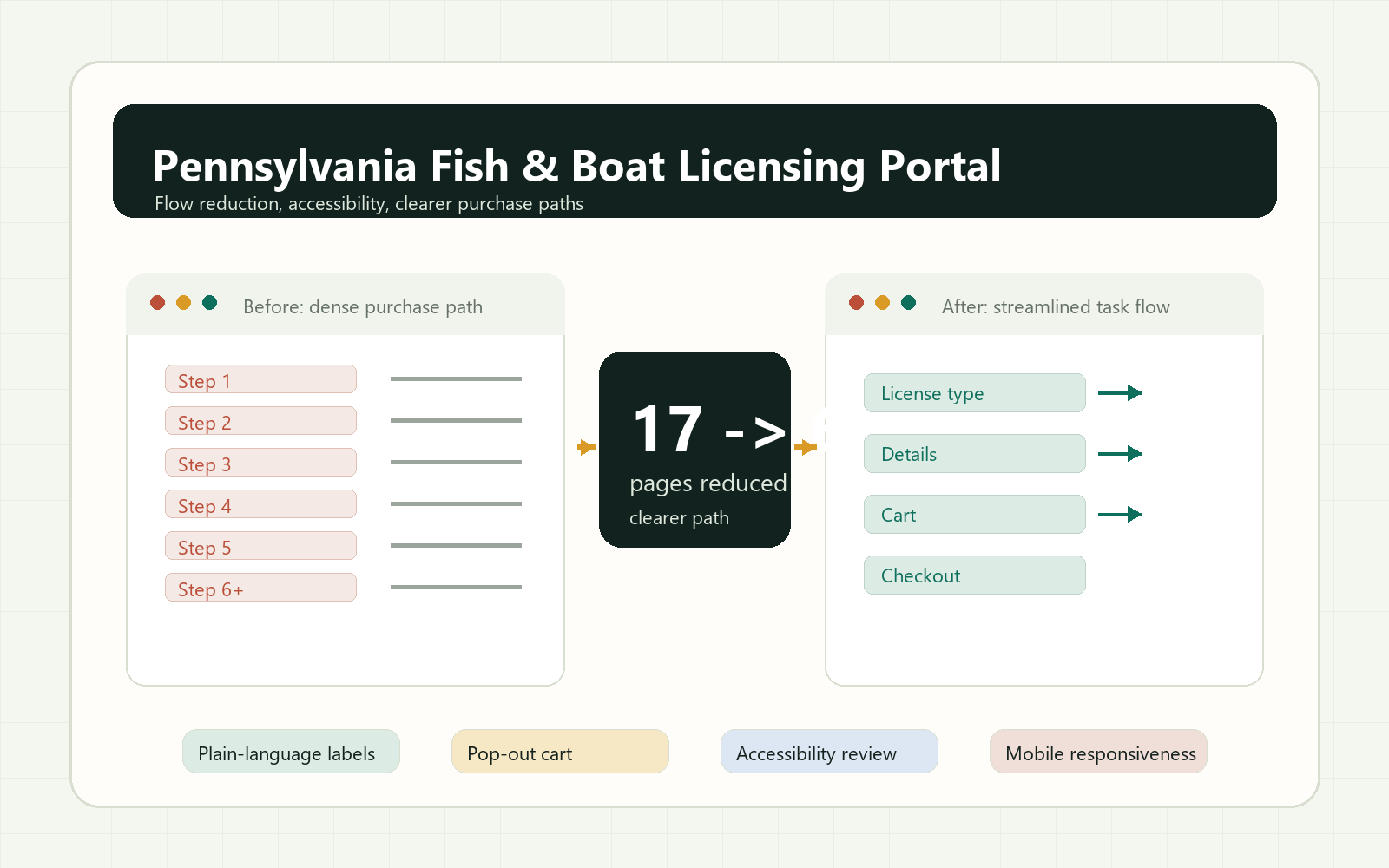
17 - > 6
pages after restructuring the licensing flow
+50%
increase in satisfaction
15%
faster approvals through clearer workflows
The redesigned direction focused on plain-language hierarchy, a clearer purchase path, stronger accessibility support, and mobile-friendly patterns.
Outcome summary
Reduced the licensing purchase flow from 17 pages to 6 while improving accessibility, task clarity, and confidence for users buying hunting and fishing licenses.
Project Overview: Streamlining License Acquisition
I focused on transforming the process for obtaining hunting and fishing licenses. The goal was to create a faster, clearer, and more efficient experience for customers who wanted to purchase licenses without feeling slowed down by unnecessary steps.
Challenge Identification: Addressing Process Inefficiencies
The existing process was lengthy and cumbersome. Customers had to move through too many pages, review repeated information, and make decisions inside a flow that did not match how quickly many people wanted to complete the task.
User Insights: Understanding Diverse Needs
Through user feedback and journey mapping, I saw that license buyers were not all approaching the process the same way. Some users treated the purchase as part of a larger recreational plan, while others simply wanted a fast transaction. Both mindsets needed a clearer path.
Role and Contributions: Defining My Impact
As a Senior UX Designer, I focused on improving the licensing experience with accessibility, task clarity, and consistency in mind. I helped restructure the flow, improved calls to action, introduced a pop-out cart concept, and contributed to design system guidance so other team members could create more consistent content and interfaces.
Constraints and Considerations: Navigating Limitations
The work had to fit within existing technical and software constraints. Because large platform changes were limited, I focused on improvements that could reduce friction within the available system while still supporting compliance, accessibility, and internal review needs.
Research and Approach: Turning Friction Into Direction
I mapped the licensing journey to identify where users slowed down, repeated work, or questioned what to do next. These moments became the focus areas for simplifying the application and improving the sequence of decisions.
- Mapped the full licensing journey from entry to purchase.
- Prioritized areas where users encountered confusing labels or repeated steps.
- Collaborated with stakeholders to identify feasible improvements.
Solution: A Clearer, More Accessible Purchase Path
The final direction simplified the license selection hierarchy, reduced unnecessary screens, improved form clarity, and made key actions easier to recognize. The redesigned purchase path supported both quick transactions and users planning a broader outdoor trip.
Results and Reflections: Achievements and Lessons Learned
The project reduced the licensing process from 17 pages to 6. Removing non-essential steps, clarifying the purchase path, and introducing a pop-out cart helped streamline the experience. The work reinforced the importance of designing for different user mindsets: quick completion for some, planning support for others.
Conclusion: Commitment To User-Centered Design
This project reinforced my commitment to designing around real user behavior. By listening to customers, simplifying decisions, and aligning the interface with user expectations, I helped create a licensing experience that was more efficient, accessible, and useful.